pavanaarekh

Wind rose Plotting Software

AERMODCloud Software

pavanaarekh is a wind rose plotting software application. It provides visual wind rose plots, frequency analysis, and plots for several meteorological data formats.

pavanaarekh is a FREE software

Support multiple file formats like, *.xls; *.xlsx; *.csv; *.asc (ISCST3); *.sfc (AERMOD); *.pfl (AERMOD); *.sam (SAMSON).


AERMOD Cloud®

AERMODCloud Software

Experience the power of a truly integrated AERMOD air dispersion modelling system with AERMOD Cloud. Our innovative platform combines AERMOD, AERMET, AERMAP, and BPIPRM into a single, user-friendly interface, making it easier than ever to model the dispersion of air pollutants from various emission sources.

Designed primarily for Environmental Impact Assessment (EIA) studies, AERMOD Cloud provides advanced capabilities for modeling the dispersion of air pollutants from point, area, volume, open pit, line, and polygon area sources. With AERMOD Cloud, you can take your air quality assessments to the next level and make more informed decisions about the environmental impact of your projects.

Why is the isopleth plot not matching the wind rose plot? Here are the reasons how these two plots are different and why they should not be compared directly. They should be used in conjunction rather than compared against each other

Why Is the Isopleth Plot Not Matching the Wind Rose Plot? A Look at Two Key Tools for Air Quality Management

As an air quality specialist, I'm often asked about the discrepancy between the isopleth plot and the wind rose plot when interpreting concentration isopleth plots. Some people assume that the isopleth plot represents the same information as the wind rose plot and that the highest concentration of pollutants should occur in the opposite direction of the predominant wind. However, it's important to understand that these two plots represent different variables and should not be expected to match precisely.

The isopleth plot shows the concentration levels of pollutants at various locations, while the wind rose plot displays the frequency and direction of wind. Therefore, while there may be a correlation between the two, they do not necessarily depict the same information.

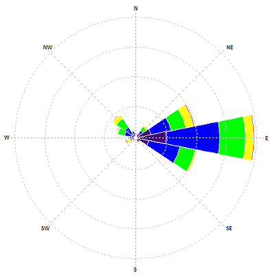
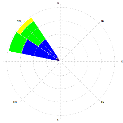
The wind rose plot displays wind speed and direction with date and time, providing information on wind patterns in a specific location. Whereas, the concentration isopleth plot represents the spatial distribution of pollutant concentrations based on many parameters, including topography, source and receptor location, and several meteorological factors such as temperature, humidity, cloud cover, mixing height, and atmospheric stability etc. Further, topography plays a significant role in the distribution of pollutants, and it is accounted for in the isopleth plot but not in the wind rose plot. The isopleth plot provides a complex representation of how various factors contribute to pollutant dispersion, whereas the wind rose plot is based on just two parameters - wind speed and direction. Therefore, these plots serve different purposes and represent different data.

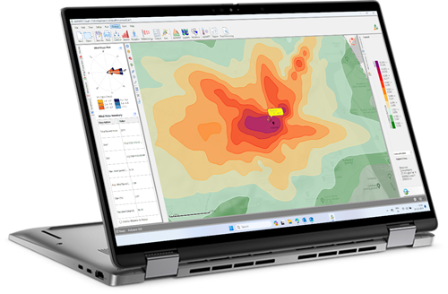
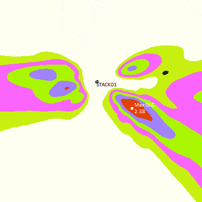
To explore this concept further, let's take a look at two figures: the wind rose plot and the isopleth plot. Figure (a) shows a wind rose plot that depicts wind patterns over a period of three months, while figure (b) shows an isopleth plot that depicts the maximum 24-hourly averaged concentration of a pollutant. Note that the isopleth data were generated using the same meteorological data used to create the wind rose plot.

Example Image
Figure (a) Wind rose plot of hourly wind data for 3 months
Looking at the wind rose plot (Figure a), we can observe that the winds predominantly blow from the east to the west. Based on this observation, one might assume that the highest concentration of pollutants should be in the west of the emission source, in the opposite direction of the predominant wind.

Example Image
Figure (b) Isopleth of maximum 24 - hourly averaged concentration of a pollutant
However, the isopleth plot (Figure b) shows the maximum concentration of the pollutant in the southeast direction, which is contrary to what we might expect. It's important to note that this isopleth represents the maximum 24-hourly averaged concentration of the pollutant and not the average concentration over the three-month period.

So, what's going on here?

It's important to understand that in this case, the wind rose plot represents wind patterns over a three-month period, while the isopleth plot depicts the maximum 24-hourly averaged concentration of the pollutant, which can occur on any given day during the same period.

Example Image
Figure (c) Wind pattern on the specific day when the model estimated the maximum concentration
Additionally, by reviewing the model output file, you will find that a date is mentioned along with the estimated maximum 24-hourly averaged concentration of the pollutant. This will help to identify the date when the maximum concentration occurred. Now, consider Figure (c), which represents the wind pattern on that same date when the model estimated the maximum concentration. We can see that the wind was blowing from the northwest (NW) direction on that day, which explains why the maximum concentration was estimated to be in the southeast (SE) direction in the isopleth plot.

In conclusion, the isopleth and wind rose plots are useful tools for studying the relationship between wind patterns and pollutant concentrations. However, it's important to remember that they represent different variables and should not be expected to match precisely.

The reference to "model output file" in this article pertains specifically to the output generated by the AERMOD air quality dispersion model.

Sudhanshu Kumar

Dr. Kumar is a highly experienced expert in air pollution meteorology and atmospheric dispersion modeling, with over 29 years of experience. He has delivered numerous presentations on specialized topics related to air and noise quality. Additionally, he has authored the lead environmental modeling software published by Envitrans®.

Wind rose diagrams for selected stations in India

Wind rose diagrams for selected stations in India are freely available. The distributions of the resultant wind direction and speed are in units of percent. Wind speed is displayed as a function of direction in seven speed classes.


air dispersion models ready Data Services

Meteorological Data Services

We offer CALPUFF, AERMOD, AERMET ready WRF data for direct input into dispersion models.

X
Do you need any help?

Please wait...

Your opinion is impotant to us, please help!


Have you found what you were looking for on the site?